NOTE: I no longer need to use this method. With the new Trace by color feature, this can all be done in MTC. This post is left as a reference only.
I use PSE 7 a lot with MTC and the Lettering Delights graphics. I don't always need to take them into PSE but if it looks like I am having some trouble pixel-tracing I will pull them over and seperate colors there. Several people in the MTC forum have aksed about this so I thought that I would do a tutorial (I was going to say short tutorial but I am not too sure how short it will be!)
I use PSE 7 a lot with MTC and the Lettering Delights graphics. I don't always need to take them into PSE but if it looks like I am having some trouble pixel-tracing I will pull them over and seperate colors there. Several people in the MTC forum have aksed about this so I thought that I would do a tutorial (I was going to say short tutorial but I am not too sure how short it will be!)
I chose the first graphic because it was the hardest in this set to pixel trace in MTC.
After you open the graphic in PSE, click on the Magic Wand tool (see arrow below).
If you get this error, click OK.
Choose a color to start with. I chose the yellow color. Hold the shift key while selecting every area that is yellow in the picture. When all are selected, hit Ctrl-Shft-J. This will cut your selections and place them on another layer. The graphic will not look any different but if you close the eye on first layer, only the yellow selected areas will be visible in the new layer. Close the eye on the new layer and open it on the bottom layer. Be sure the bottom layer is hightlighted (click on it) and go through each of the colors, placing each on their own layer.
Here you can see that I have several of the colors seprated into layers of their own.
At this point you can save each layer and import into MTC (which we will do in a moment) but I want to point out an easy way to darken your graphic or colors. With your color or graphic layer highlighted, go to Enhance-Adjust Lighting-Levels (or Ctrl-L) to bring up this box.
Slide the carets all the way over to the right and everything will turn black. This makes the lighter colors easier to trace in MTC. You do not have to do this with all colors (it is an extra step) but it may help if you are having trouble tracing some of the lighter colors in MTC.
You can also do this to the origianl graphic (before the colors are seperated out) to get a good image to use for a backout of the graphic.
Important: PSE will automatically save to its default file extension, .psd. You will have to change the save option to .jpg by using the drop down menu. In the screen shot below you can see that I have saved several colors already as jpgs.
Open MTC (finally!) and import each color into MTC using pixel trace. You may need to change the threshhold level to get it to trace some of the lighter colors. With the light blue I had to go up to 225 in order to get a trace.
This is important! After you have traced the first color, click off the image to the left so that the trace is no longer highlighted. The caret should be to the left of the image. The images are brought in at a very large size and we want to stack them so that we can reduce them in size together so that they are proportionate. This will help with that process.
The first arrow shows the caret, the second arrow shows the bounding box for the light blue color trace.
Bring in each color. With this graphic there will be 9 traces (the blackout, the colors and white because there are sections that need to be cut as white)
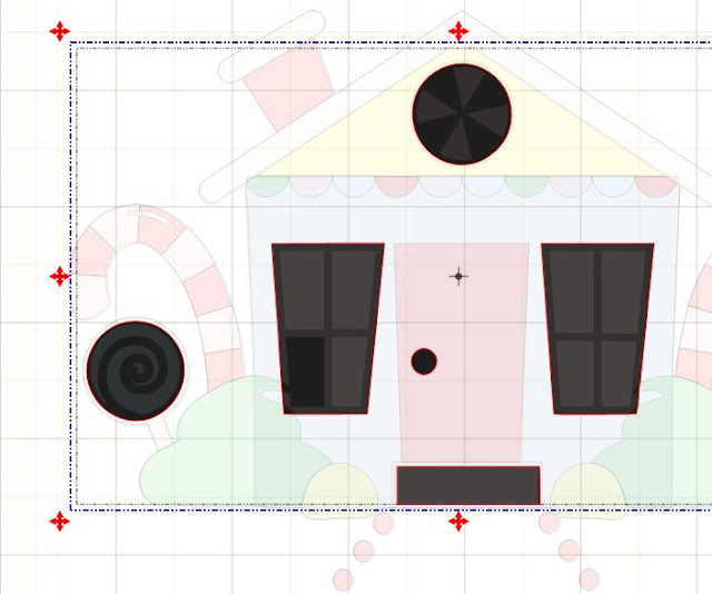
As you bring them in remember to keep them stacked on top of each other. Before tracing the next color, click off the color to the left so that the caret is seen. This screen shot shows 1) the caret, 2) first color traced, and 3) second color traced.
After you have traced all the colors, you can assign each trace a layer and a different color. Then Select all and reduce the overall size of the graphic. I choose to change the height to 5" (Be sure the lock is locked)
Once reduced, this what my graphic now looks like.
(You can see I forgot to stack one of the graphics!)

I wanted the blue house shape to be without cutouts for the windows so I removed them by welding in a square from Basic Shapes.
The windows (white behind the pink) were not square so I used Basic Shapes to even them out.
I wanted the candy cane to be a light pink with red overlay so I added (copy and paste in place) the red shapes from the red layer to the pink layer. This left some gaps in the candy cane which I fixed with a weld of some ovals.
After playing around a little more I have my final cut file (which I have not cut yet). Here is a picture of it in comparison with the original file.


4 comments:
Nelda, great tut.
Glad you picked a complicated image so we could really learn how to work with them! Great job and thank you!!
Thanks for the tut. I learned a lot just reading it. Now to try it out...
How do you figure this all out? You are one smart cookie.So nice of you to help us all out.
Post a Comment